
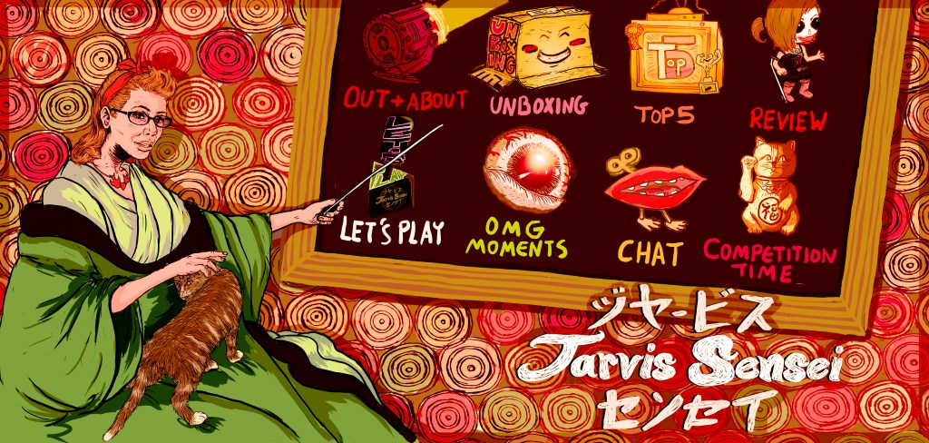
So I know I’ve been away for a long time but I am back with a rebrand for the channel. Some of you might know Xander from previous videos, but for those of you who don’t: he is one of my best buds who happens to be a super cool artist. His art is like nothing I have ever seen. It’s fresh, bizarre and totally unique (for a look at his stuff, check www.xander-lee.co.uk or his instagram ‘@ahrekisanda’)
Anyway Xander’s with me today as we are about to launch my new and improved channel, with a tonne of new, exciting and original art for the banner and thumbnails. I thought we could have a chat about his inspirations and thoughts on the work.
When I first approached you about collaborating on this channel, what were your thoughts?:
That not only would it be a chance to support my friend in this new venture, but also a good excuse to try designing for a medium I have long since been interested in, having previously experimented with video.
How much has the original concept for the channel change over the past six months?:
Instead of looking at just Youtube or Twitch in regards to gaming related videos, we looked further back at what came before on the small screen, such as ‘GamesMaster’, ‘Bitz’, ‘Movies, Games and Videos’ and ‘Bad Influence’. I’m more versed in that era and you have a greater knowledge of the contemporaries, so together we can draw from this expansive catalogue of material, the history of computer game presenting if you will. This gave us the opportunity to be more versatile and creative with future formats and ideas.
Your channel artwork holds many pop culture influences and hidden little geeky, easter egg type references. How did you decide what to include, to create this cohesive vision despite using all these influences?:
For the titlecards on the channel I aimed to create some sort of key aspect, like a mascot that could anchor and focus all the essentially extraneous details in each one. Being that I’m obsessive about so many books, games, movies and the like, it’s always a chore, choosing what not to include, to have viewer focus on the point. With over a hundred years of culture, each decade informing the last, and now (high speed) internet chronicling it all, there’s so much to choose from.

The ‘Unboxing’ title was the first card I produced and I know that you didn’t want to be seen as one of those infamous ‘gamergirls’, but to be bonafide, albeit in an understated manner. I took to using many of the geeky things you like to flavour the piece, showing that your just as fanatical as anyone else with their dedication to many different franchises and products. This theme of ‘one of us’ I took further, setting it in a ‘fantasy’ version of your bedroom, its quite slovenly, with mugs and old Chinese food and other detritus that show you aren’t the feared Bitmap Barbie with her feminine wiles, scourge of the seven internet seas. Then when I had this setting it was much easier to insert and hide the aforementioned pop culture around, making it more organic to do so.
Which is your favourite title card?
I like ‘Chat’. I think it was the second one I did and I felt I started to hit my stride, thematically linking them all together, as this and another are set in the same room, the glimpse outside the window is of the ‘Top 5’, an advert on one of the lower televisions (though cropped out) appears on a billboard in Out and About, and so on. I think Let’s Play was the only one separate as obviously that’s all about the game in question, hence its puritan, Tron inside the computer system, Tetris blocky surrounding. Now drawing Bubbles like I draw all my french girls, that was a heap of fun, and I got to use a study of the Batphone from something else that fell through, which was cathartic. I do have a soft spot for those custom funkopops in ‘Review’ aswell.
What was the biggest challenge?:
Typography and colour. Type isn’t exactly my strongest feat, and having to design distinct typefaces for each title card and have them legible across multiple devices/screens sure was something. The same problems arose with colour palettes, as some colours have a tendency to go off hue across devices, and much like the forethought of designing distinct mascots, I also wanted to steer towards certain colour schemes. There were nights I spent messing around with photo filters on phone apps before turning in, which in turn allowed me to discover the actual photo enhancing features of Photoshop, obviously using it primarily for illustration. Even now that’s strange to think about.
Other than that, the fact that neither of us knew exactly what or how much graphics we’d end up needing; I only realised we’d need a road trip, out in the wild type category after finishing the rest. ‘Competition Time’ and ‘Review’ also got complete overhauls around this time as they were weak as identities in comparison. I got to re-appropriate the Batman Forever Riddler Box from the latter to become the ‘Post Video Subscribe ident sequence that I also wasn’t familiar with/forgot about so hope we get to use it. As to paraphrase Mr Carrey, to be better than good, it’s all about ‘showmanship’!
For me personally it has been an honour to work with Xander on this project. Not only is he a friend but someone I truly admire. I hope that you all enjoy his work as much as I do.

To be one of the first people to see the new artwork head to my channel over the next week:


Leave a comment