
Welcome to a new feature that we will be doing ever so often on The Phoenix Remix. Ever so often, I get sent albums and CDs from PR companies so what better way to celebrate these then doing an unboxing of the music I get sent. Nowadays, we tend to listen to a lot of our music through streaming services so the magic of opening a CD case for the first time is getting lost. So I thought I would write this new article that I hope everytime you read the name of it you have Lost In Music by Sister Sledge in your Head because I did when I came up with the name – Unboxing Music. Today we look at the album by Marianas Trench’s latest album Phantoms that I only got recently in a physical copy.
Cover
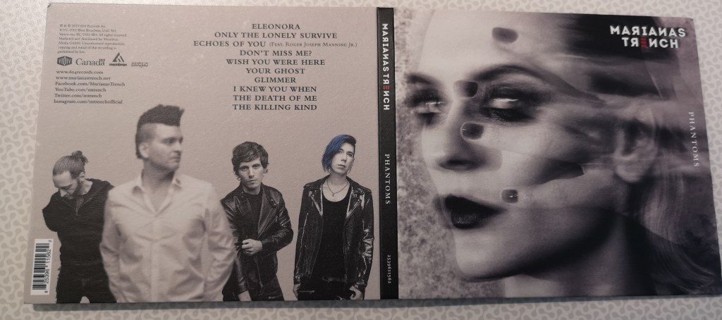
 On initial first glances of the album cover it isn’t very colourful – it is full of different tones of grey – this works well on the front cover as it sort of creates a ghostly sort of feel to it. Looking at it initially it reminds me of the album cover for Placebos Sleeping With Ghosts as that had images of ghost like body parts. The Placebo album was quite vibrant in colour but this album isn’t but that is good because they are both connoting different emotions. The only highlight of colour is in the logo (or the promotion of singles on the album before you discard the plastic.)
The album cover is made of a card like material and as the image shows below the design on the back cover where the list of songs are both compliment and contrast the front cover. I really like the way that the text is positioned really neat on the back – the song titles on the right and the information about the management etc on the left. The one thing that I really like about the back cover is the fact that the background behind the band is a very plain grey without texture – if you look at the front cover there is a lot going on and in the background their is a noise texture to the grey which I feel welcomes you into the narrative of the album. Being called Phantoms the business of the background highlights this as well.
Also lets quickly talk about the title of the album and where it is positioned on the album cover. Usually when you buy an album, the title is front and centre and a big part of the design but with this one the title is placed at an angle in a smallish font on the right hand side of the album. Whilst it may come across as a bit unusual doing this I think it is really interesting use of the album space. Look at where it is positioned – look at the graphics surrounding the text – it sort of has this feel that the album cover has come on with the wisp of the hand that is faint.

Inside Cover

The inside cover follows the theme of the outside by having an extreme close up of the woman on the front disc which sort of feels like you are being welcomed into the world of Phantoms and it is reeling you in. Yet again, the name of the album is hidden but if you think about the theme of the track I think it is actually pretty effective.
On the left hand side of the CD there is part of a poem, from doing research online it is actually on part of a poem that lead singer Josh Ramsay wrote with influences from Edgar Allen Poe and in the recent tours across America and Canada, the poem is read in it’s entirity as part of a welcome video to the show.
I did a bit of research again because I didn’t really know wh at a Widows peak was, I knew that it was something about a house as I knew that inspired the album but it is actually a style of Victorian house. When you google them you sort of feel the haunting around them and can understand why so many horror stories are set around them.

The fact that the album cover uses predominantly grey tones, the bold black with white text makes this really stand out and makes the words on the card stand out. When you take the CD away from the case you are welcomed with another image of the same woman but this time there is an essence of black blocking part of the face. Again I do not know if this is a deliberate choice but when you read the poem and then see this image it feels like two of them sort of collide and sort of creates a connotation that when you listen to the album both of these significiant worlds collides together.
Booklet

When you take the booklet out of the album sleeve you are welcomed by a really dark image of just the outlines of a someone screaming. I really like this use of photography and I feel that it really contrasts everything that we have seen up to now. I like the fact it feels like you are entering a world of the narrative and also the theme. I think it is an image that sort of makes you want to delve into the world of the album and also intrigued to see what is on the next page.
When I do open the booklet in some ways it leads to surprise to what I see. There are two types of booklets – the ones that only have images and the thank yous in it and the ones that have the lyrics in them – I haven’t seen a booklet in so long that takes the times to put all the lyrics to all the songs in it but this one does and it is fantastic. The best thing about this is that esepcially for younger fans, that this gives them the opportunity to read the lyrics and sing along.

From reading the lyrics, they also have a strong reflection of why the album is designed the way it is so having the lyrics I think is a very strong thing to do to highlight the theme even more.
Each band member is on one of the pages and it is a collage of two photos edited together – one of the images has a bit of opacity. This is a great and unique way again of bringing the sense of ghost and haunting to the overall theme.
Verdict
Overall, I think that this is a really interesting album cover – I feel that the design really reflects the tracks and the design concept has been well thought out. I really like the use of colour on the album and feel that the little use of it makes the parts that do have colour really stand out.
Read the Phantoms album review here
To read our interview with Josh Ramsay ahead of the UK Tour then click here


Leave a comment